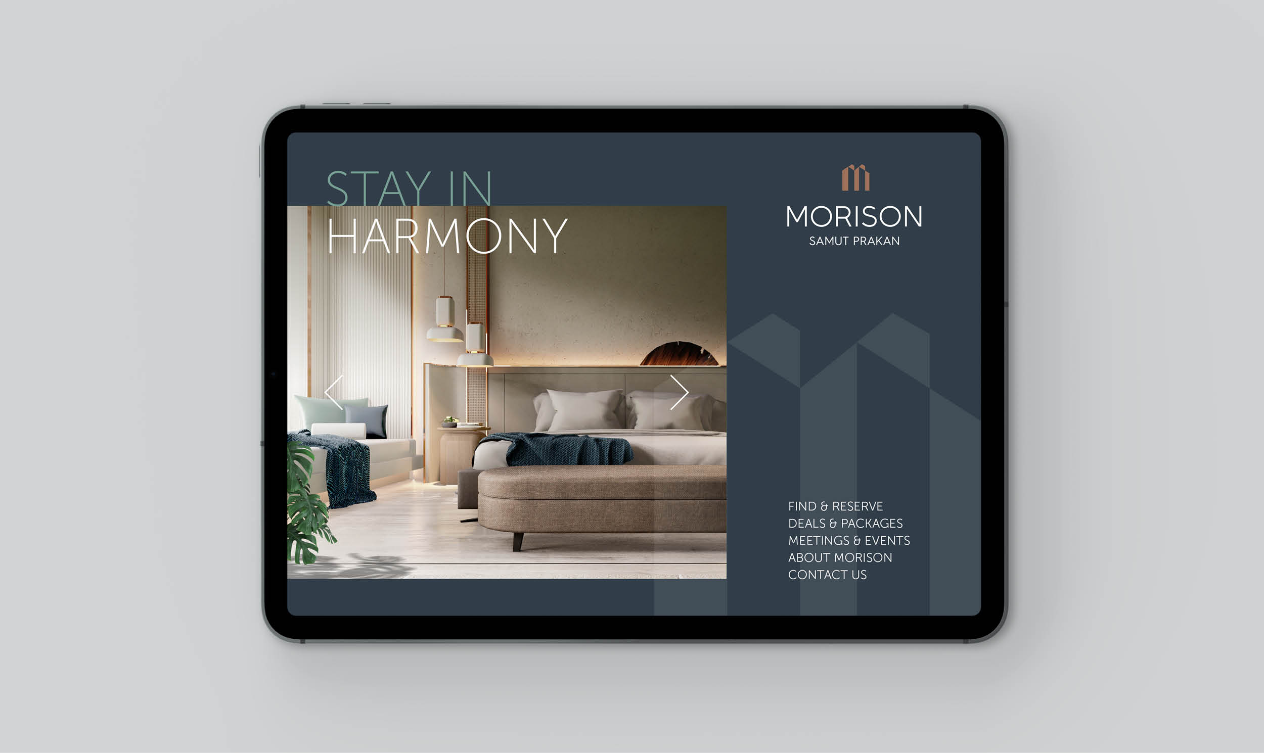
MORISON
Balancing nature with design, modernity with culture, work with play, Morison Hotel is an experience that inspires and uplifts.
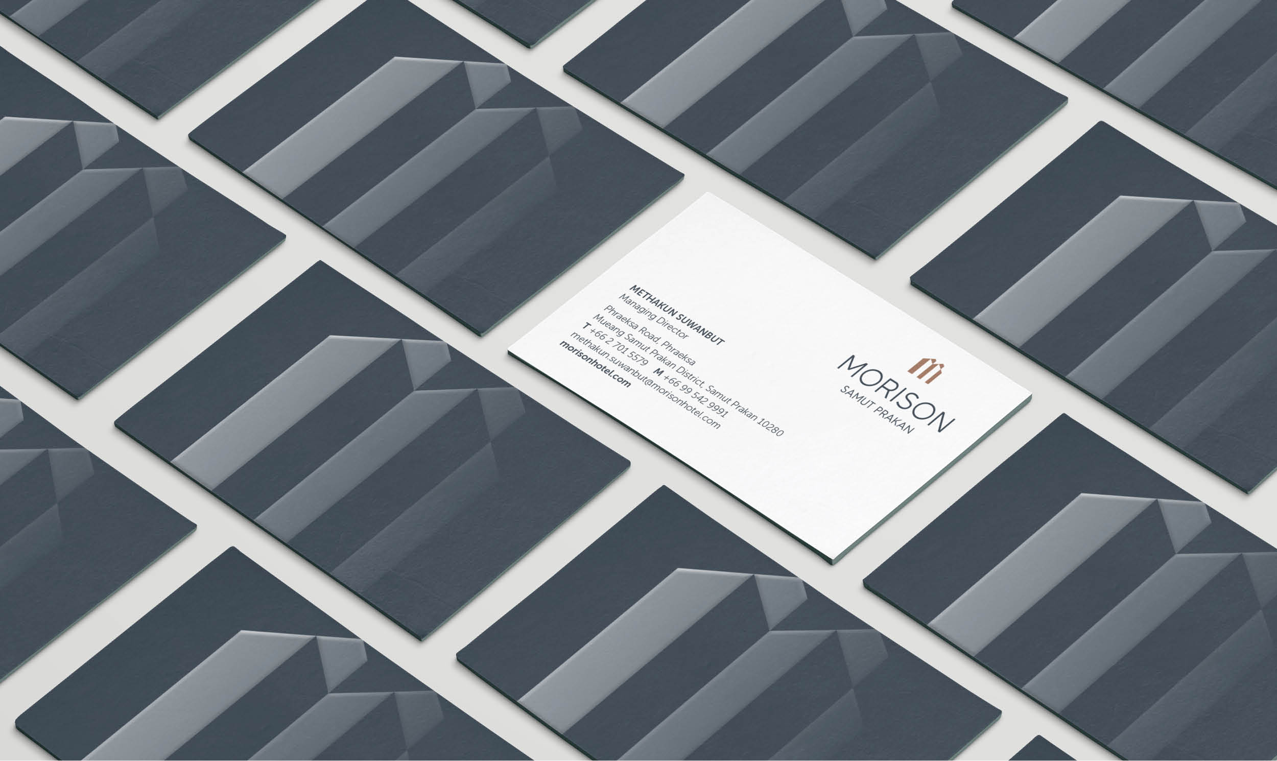
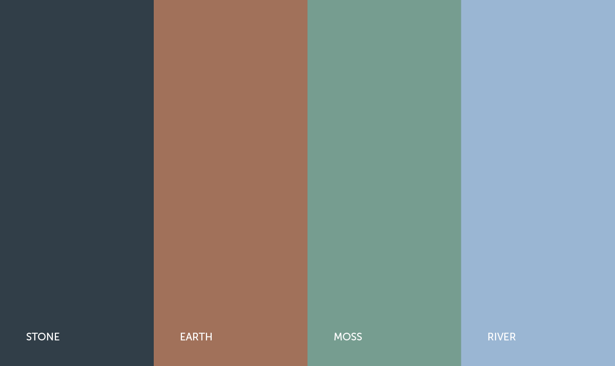
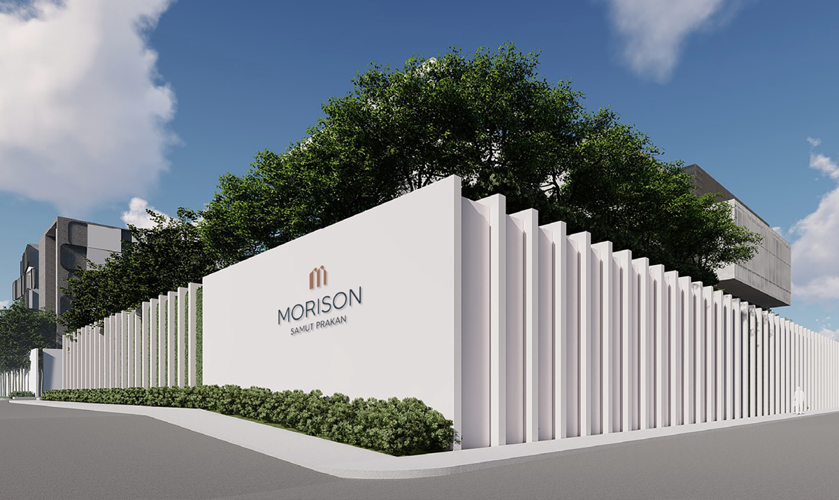
The abstract mark above the letterform, resembling a letter ‘M’ while reflecting the architectural lines of a hotel structure. The brand colour palette conveys a sense of balance between nature and the built environment.
The abstract mark above the letterform, resembling a letter ‘M’ while reflecting the architectural lines of a hotel structure. The brand colour palette conveys a sense of balance between nature and the built environment.
Scope
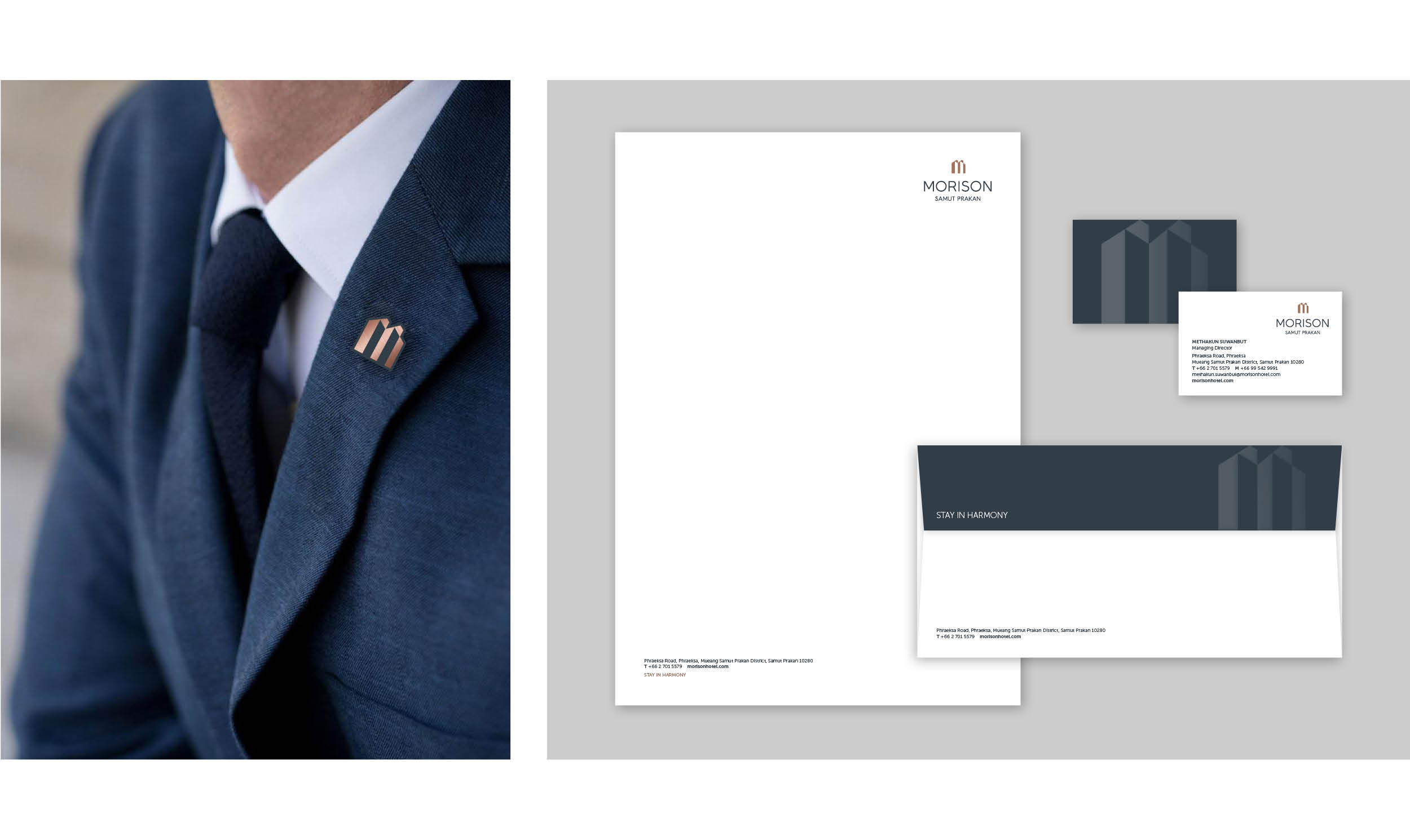
Logo and visual identity
Brand collateral
Brand guidelines
Logo and visual identity
Brand collateral
Brand guidelines